Introduction:
Color is one of the most powerful elements in interior design. It can set the mood, define a space, and influence how we feel within a room. Understanding the basics of color theory can help you make informed decisions about color schemes that work harmoniously and create the desired atmosphere in any interior. This guide will provide an overview of color theory and offer tips and tricks for effectively applying it in your interior design projects.
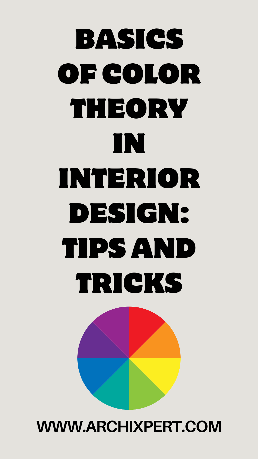
1. Understanding the Color Wheel
Overview:
The color wheel is a fundamental tool in color theory. It visually represents the relationships between colors and helps guide the creation of color schemes.
Key Components:
Primary Colors: Red, blue, and yellow. These are the foundation of the color wheel and cannot be created by mixing other colors.
Secondary Colors: Green, orange, and purple. These are created by mixing two primary colors.
Tertiary Colors: The colors formed by mixing a primary color with a neighboring secondary color (e.g., blue-green, red-orange).
2. Color Harmony and Schemes
Overview:
Color harmony refers to pleasing color combinations that create a balanced and aesthetically appealing look. Understanding different types of color schemes can help you create harmonious interiors.
Types of Color Schemes:
Monochromatic: This scheme uses different shades, tints, and tones of a single color. It creates a cohesive and soothing look, ideal for minimalist or serene spaces.
Tip: Vary the textures and materials to add depth and interest to a monochromatic room.
Analogous: This scheme uses colors that are next to each other on the color wheel (e.g., blue, blue-green, and green). It creates a harmonious and visually pleasing flow.
Tip: Use one dominant color and the others as accents to avoid overwhelming the space.
Complementary: This scheme pairs colors that are opposite each other on the color wheel (e.g., blue and orange). It creates a high-contrast, dynamic look.
Tip: Use complementary colors in balanced proportions—one color can dominate, while the other serves as an accent.
Triadic: This scheme uses three colors that are evenly spaced around the color wheel (e.g., red, yellow, and blue). It creates a vibrant and balanced look.
Tip: Choose one dominant color and use the other two as supporting or accent colors to keep the design cohesive.
Split-Complementary: This scheme is a variation of the complementary scheme, but instead of using the direct complement, you use the two colors adjacent to it (e.g., blue, yellow-orange, and red-orange).
Tip: This scheme provides contrast but is softer than a direct complementary scheme, making it easier to work with.
Learn How to Migrate to Shopify
3. Warm vs. Cool Colors
Overview:
Colors are often categorized as warm or cool, and each category has a distinct impact on the mood and atmosphere of a space.
Warm Colors:
Examples: Red, orange, Yellow effect: Warm colors evoke feelings of energy, passion, and warmth. They can make a space feel cozy and inviting.
Tip: Use warm colors in social spaces like living rooms, dining rooms, or kitchens to create a welcoming and lively atmosphere.
Cool Colors:
Examples: Blue, green,
Purple effect: Cool colors evoke calm, relaxation, and tranquility. They can make a space feel more spacious and serene.
Tip: Use cool colors in bedrooms, bathrooms, or home offices to create a soothing and restful environment.
4. The Psychology of Color
Overview:
Color psychology explores how different colors affect emotions and behaviors. Choosing the right colors based on their psychological effects can enhance the functionality and mood of a room.
Key Color Associations:
Red: Energy, excitement, passion. Red can stimulate conversation and appetite, making it suitable for dining areas or social spaces.
Blue: Calm, stability, productivity. Blue is often used in bedrooms, bathrooms, and offices to create a peaceful, focused environment.
Yellow: Happiness, warmth, optimism. Yellow is great for kitchens, hallways, or any space where you want to promote positivity and energy.
Green: Balance, renewal, tranquility. Green is a versatile color that works well in almost any space, bringing a natural and calming vibe.
Purple: Creativity, luxury, sophistication. Purple is often associated with luxury and can add depth and elegance to a room.
Neutral Colors (Gray, Beige, White): Neutral tones provide a calming and versatile backdrop that can work in any room. They create a sense of balance and allow other design elements to stand out.
5. Creating Visual Balance with Color
Overview:
Balancing color throughout a space is crucial for achieving harmony and preventing the room from feeling too overwhelming or too flat.
Tips:
60-30-10 Rule: This classic interior design rule suggests that 60% of the room should be a dominant color, 30% a secondary color, and 10% an accent color. This creates a balanced and visually appealing look.
Example: In a living room, 60% could be neutral walls, 30% could be a sofa and curtains in a complementary color, and 10% could be vibrant accent pillows and decor.
Contrast and Variety: Use contrast to create visual interest. For example, pair light walls with darker furniture, or mix warm and cool colors in balanced proportions.
Tip: In open-concept spaces, use color to differentiate zones while maintaining a cohesive flow by repeating certain colors throughout the space.
Natural Light Consideration: Natural light affects how colors appear in a room. South-facing rooms receive warmer light, which can enhance warm colors, while north-facing rooms get cooler light, which can enhance cool colors.
Tip: Test paint swatches at different times of day to see how the colors change with the light.
6. Using Neutrals Effectively
Overview:
Neutrals are foundational in interior design and can create a versatile backdrop that works with almost any color scheme.
Tips:
Layering Neutrals: Combine different shades of neutrals like white, beige, gray, and taupe to create depth and interest. This works particularly well in minimalist or modern spaces.
Pops of Color: Add pops of color to a neutral room with accessories, artwork, or furniture. This allows for flexibility, as you can change the accent colors seasonally or as trends evolve.
Texture and Patterns: In neutral spaces, focus on adding texture through fabrics, rugs, and decor. This prevents the room from feeling flat or boring.
7. Experiment with Bold Colors
Bold colors can make a powerful statement in a room, but they need to be used thoughtfully to avoid overwhelming the space.
Tips:
Accent Walls: Use bold colors on a single accent wall to create a focal point without dominating the entire room. Pair it with neutral walls to balance the intensity.
Furniture and Decor: Introduce bold colors through furniture, rugs, or decor. For example, a bright sofa or a vibrant piece of art can add energy and personality to a room.
Test with Paint Samples: Before committing to bold colors, test small swatches on your walls to see how they look in different lighting. Bold colors can appear differently depending on the time of day and the room’s natural light.
8. Staying Consistent with Color Flow
Overview:
When designing multiple rooms in a home or office, maintaining color consistency helps create a cohesive and harmonious flow from one space to another.
Tips:
Repeat Colors: Use a consistent color palette throughout the home or office by repeating certain colors in different rooms. This creates visual harmony and a sense of connection between spaces.
Transition Spaces: In hallways or transitional spaces, use neutral colors or softer versions of the main colors used in adjacent rooms to ensure a smooth visual flow.
Gradation of Colors: Gradually shift the intensity of colors from room to room to create a sense of progression. For example, a vibrant living room can transition to a softer color in the hallway, leading to a calm bedroom palette.
Learn How to Migrate to Shopify
Conclusion:
Mastering color theory in interior design allows you to create spaces that are not only visually appealing but also functional and mood-enhancing. By understanding the color wheel, selecting harmonious color schemes, and considering the psychological effects of colors, you can design interiors that reflect your style and meet the needs of each space.
Whether you’re experimenting with bold colors, layering neutrals, or focusing on consistency across multiple rooms, these tips and tricks will help you use color effectively in your interior design projects.
This guide provides a solid foundation in color theory, enabling you to make informed color choices that elevate the beauty and function of your spaces.